EXPERIMENTS WITH CICADA WING PAPER
The other day my order of cicada wing paper arrived from Amazon. It took a while to arrive, coming from China. This natural-coloured extremely thin paper is supposed to be for Chinese calligraphy.
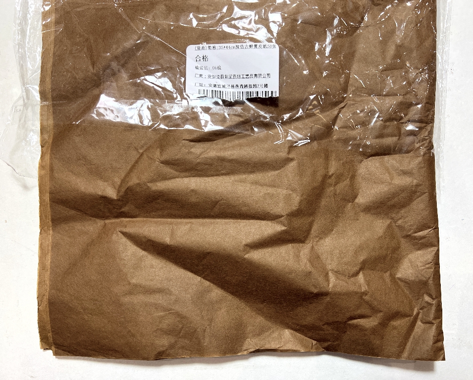
People often ask if this is made from actual cicada wings but no – I believe it is made from bamboo.
When it arrived, it wasn’t quite what I’d expected. I thought it would be a lot stiffer and more crinkly-sounding, but it has all the appearance and feel of tissue paper. It is tougher and more difficult to tear, and behaves like wet strength tissue paper. I did wonder if I’d been sent just this, which would have been annoying because wet strength tissue paper is cheaper than cicada wing paper and I didn’t want to have been scammed.
I first came across this on Sara-Lee Anderson’s YouTube channel where she had used some in an album she was making. There isn’t a lot about it on the Internet and I am going to ask Sara-Lee if she will do a video tutorial on it as it is intriguing. Looking at that video again, I can see that her paper looked very much like mine so I don’t think I’ve been sold a lemon!
Shoshi the mad scientist at work – with white coat firmly on, and wild hair (every hair not in place), I began my work!
In the absence of any tutorials on it, I decided to do some experiments of my own and see how it behaved, and how well it stood up to different media. It was only part way through this that I realised that the paper has a matte side and a slightly shiny side, so my experiments were a bit random in that regard.
Experiment 1: Heat embossing
I thought this would be a safe place to start. I chose a selection of different embossing powders, and used the same butterfly stamp throughout – one of an unbranded set. This was done on the shiny side of the paper.
For anyone not aware, heat embossing involves stamping an image using a colourless sticky ink, and then sprinkling on some embossing powder, making sure that the whole image is covered. The excess powder is tipped back into the pot to be re-used. The image is then heated with a heat tool (hotter than a hair drier) and the powder melts and becomes permanently bonded to the paper. The image is slightly raised and shiny.
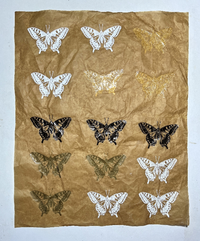
This is the back of the paper after the heat embossing.
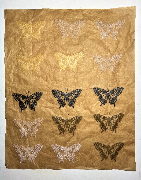
You can see that quite a bit of the embossing is clearly visible on the reverse.
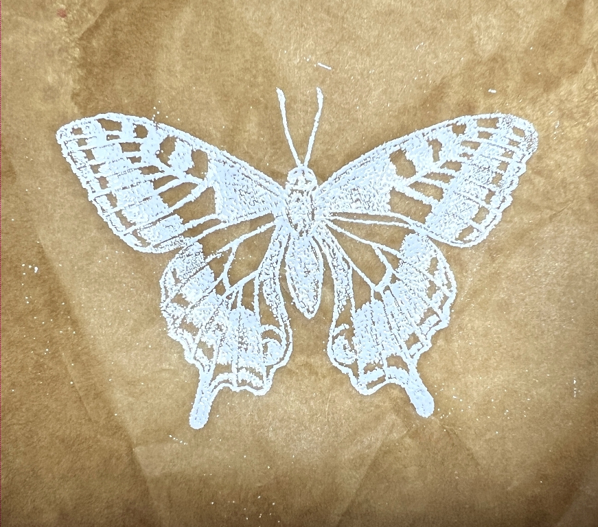
The white embossing powder worked pretty well.
Clear embossing powder. I wasn’t sure how well this would work. The photo doesn’t show it very well. In real life it looks more embedded into the surface, and darker.
When placed over some book paper, the effect is quite dramatic – the heat embossing has caused the paper to become transparent. I think this could be a very interesting effect to use on an album page.
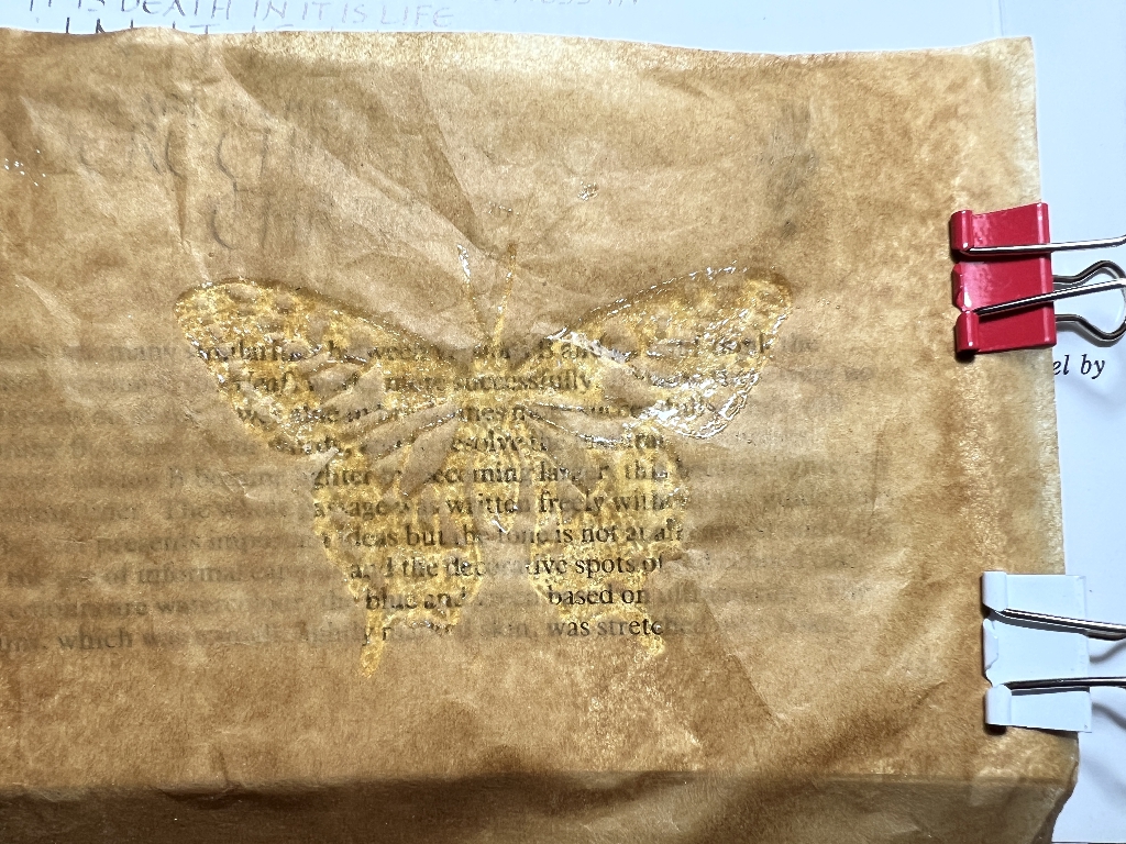
Here are some clear-embossed butterflies over two different backgrounds, one dark and one light. The transparency shows clearly. This is definitely something I can use.
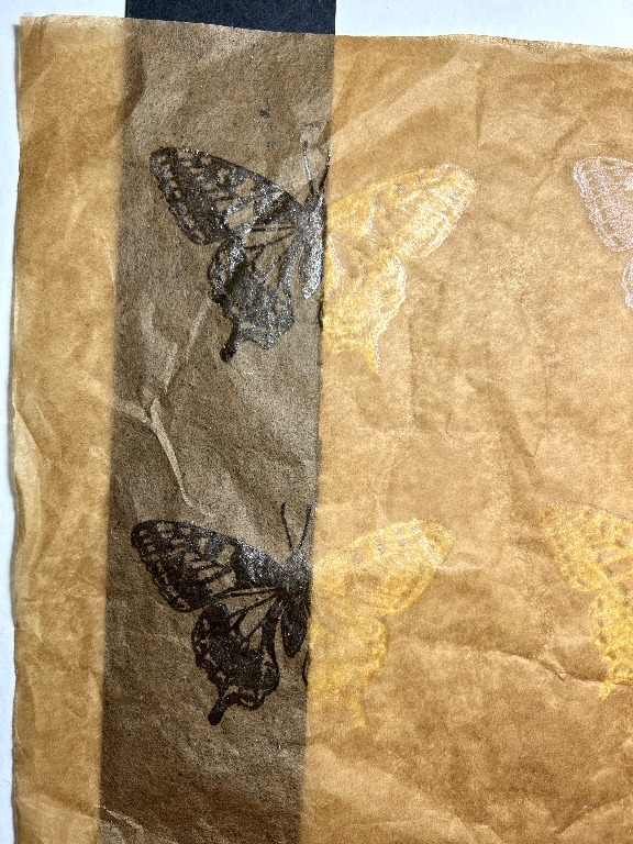
The black embossing powder also worked very well.
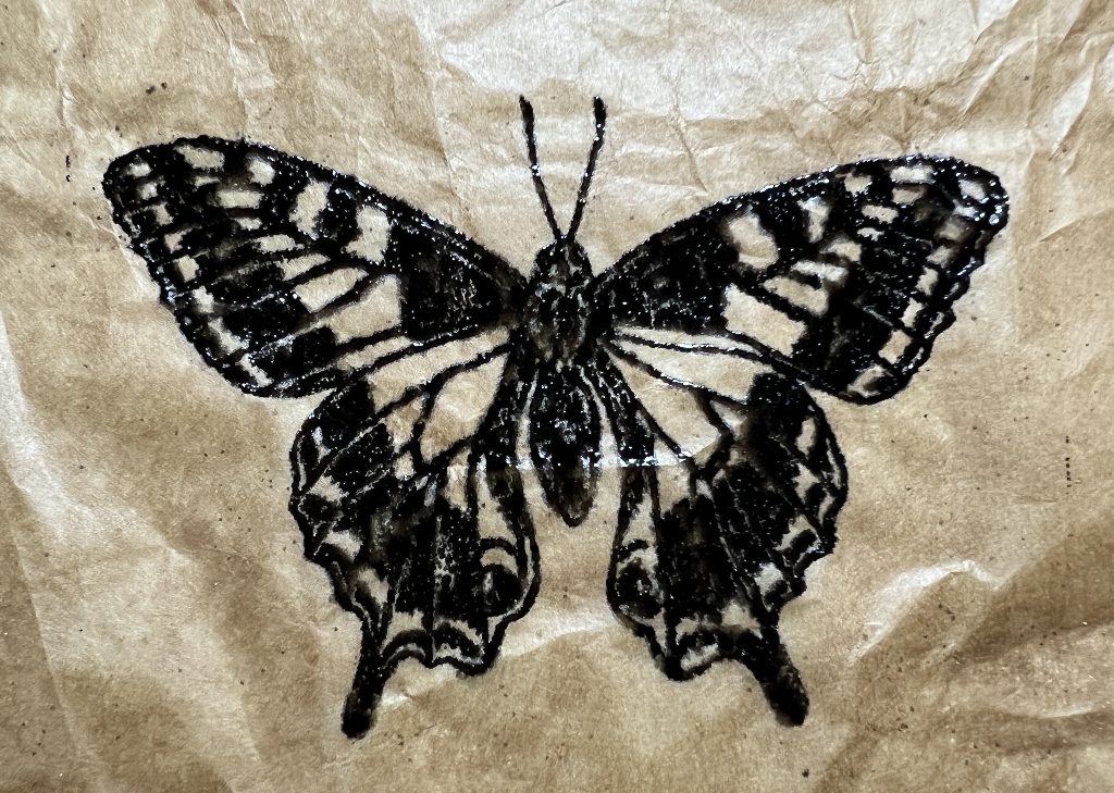
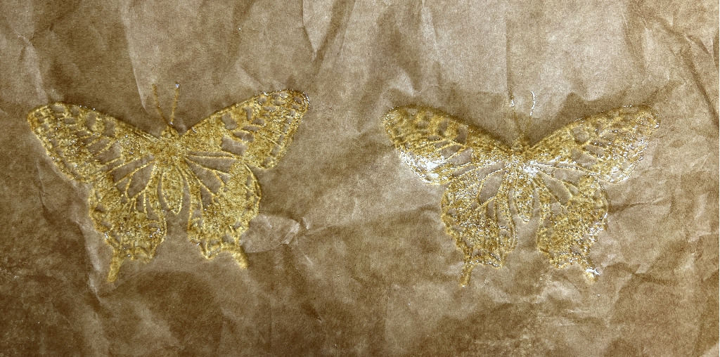
My first attempts with gold embossing powder were a bit disappointing. This powder, called “Pirate Gold” came out rather dull on this paper. Later I used a different gold which was better.
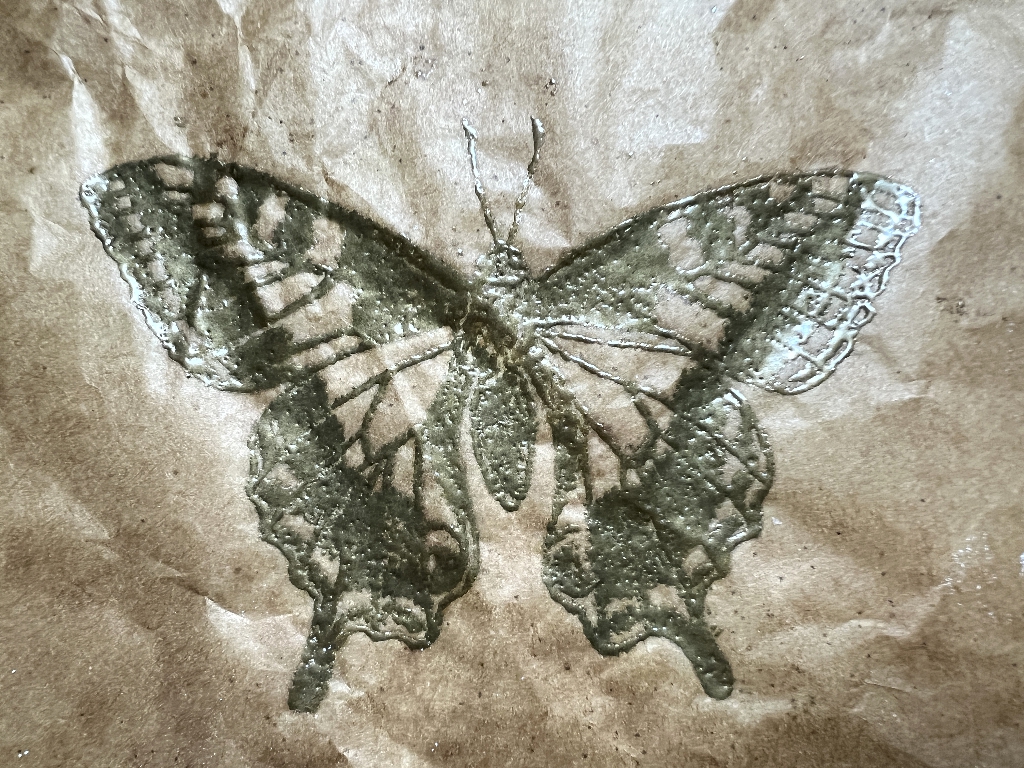
This is Aged Ivory embossing enamel by Stampendous.
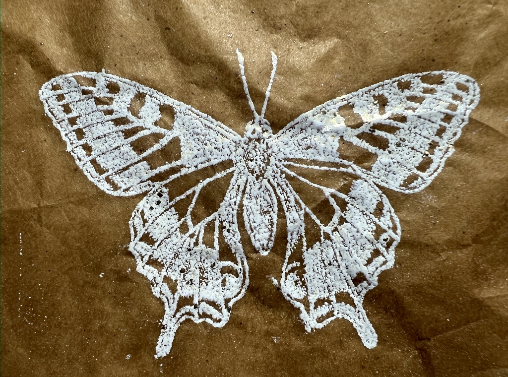
I don’t remember using this before (or where I got it from!). I prefer it to the white in many ways. It also has a slight glittery sparkle.
I think all of these are usable. I would tear around any image I wanted, I think.
Experiment 2: Distress Oxide sprays through a stencil
I used the Tim Holtz “Mosaic” stencil which is featuring quite often in my currrent Typewriter Album. As before this test was done on the slightly shiny side of the paper.
Any liquid medium seems to sink right through the paper instantly, but there is no obvious horizontal bleeding. After spraying I would have to lift the edge of the paper and mop up underneath, or the spray residue on the mat would be likely to contaminate the surrounding paper once I started moving it. Because so much seeped through, it seemed to require more ink to achieve the desired result.
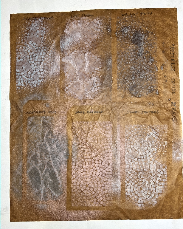
The results were variable. Because the paper was a bit wrinkled, some of the images didn’t really work at all.
For the top row, I used Frayed Burlap, Lost Shadow and Walnut stain Distress Oxide Sprays.
For the bottom row, I used Weathered Wood, Dried Marigold (orange) and Shabby Shutters (a pale green) Distress Oxide Sprays.
You can see that the Weathered Wood one was a total disaster – the stencil pattern is hardly visible at all. This area of the paper was quite wrinkled.
I wrote the details over each one using a fine Sharpie pen. This also bled right through onto the white melamine surface of the work surface, but I was able to remove it with isopropyl alcohol.
This is the back of this sheet.
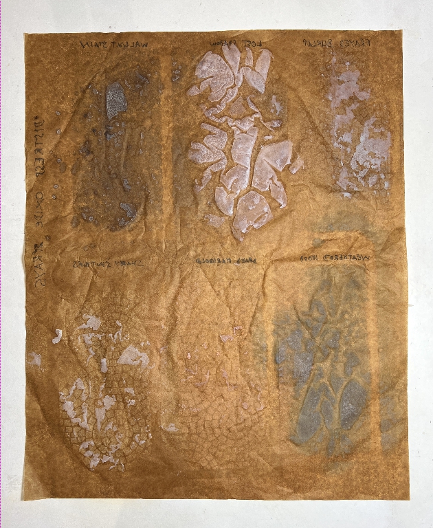
These were very interesting, especially the Lost Shadow (centre, top row) and the Weathered Wood. I shall probably tear these out and make use of the more interesting reverse side.
Turning the paper back over again, I placed a scrap strip of black card underneath to see how transparent the paper would be.

It certainly makes a difference on the background, but not so much where the stencilling is.
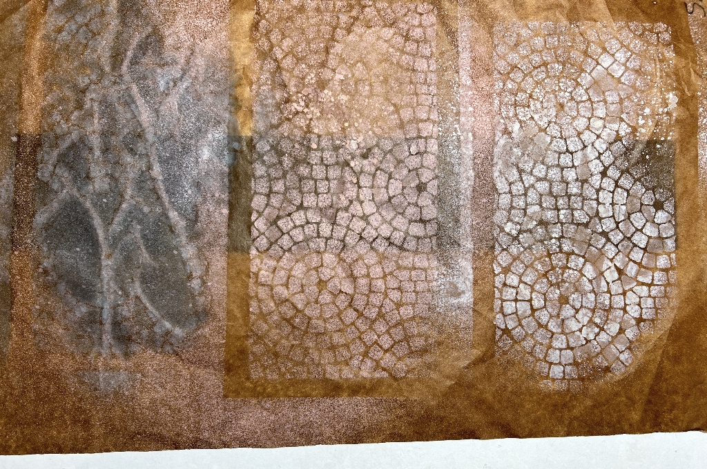
I am not sure how usable this particular technique will be.
Experiment 3: Stencilling with Polyfilla and Distress Spray Stains
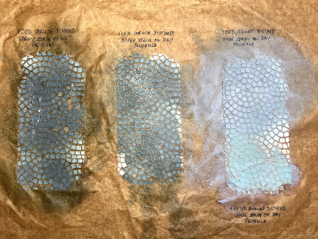
I used the matte side of this sheet, and I used Iced Spruce Distress Spray Stain for the first two, and Iced Spruce Distress Oxide Spray on the top half of the third one, and Frayed Burlap Distress Oxide Spray on the bottom half. I sprayed the ink on the first one while the Polyfilla was still wet, and waited for it to dry before spraying onto the other two samples.
I was very concerned with the first one that the Polyfilla was instantly beginning to flake off, but once it was dry, it seemed to be secure. With very thin paper like this, one has to be careful not to crease it too much or it could tend to flake off, but once the piece is stuck down onto a page, giving it more stability, I don’t see this being a problem. A coat of soft matte gel medium might help to seal everything in place.
I gave all three samples a bit of a blast with the heat tool to speed up the drying, and then left them overnight to dry fully. The Polyfilla feels a lot more secure now, and less likely to flake off.
This experiment was definitely more successful than the Distress Spray Stains one, which also required a lot more ink to give the desired effect, and a lot more mopping up underneath, too, so rather wasteful for a not very spectacular result.
I want to try experimenting with genuine moulding paste through a stencil, not just on this paper but on other papers too. I found I’d got another pot of this, of a different brand from the one I used before, and this might prove more successful. Being acrylic gesso-based, this medium acts as a resist, and the raised stencilled areas end up paler than the background, which is the reverse of what you get with the Polyfilla.
Experiment 4: More heat embossing
I used a selection of stamps for these two sheets, and shall definitely be able to cut or tear these out and add them to projects.
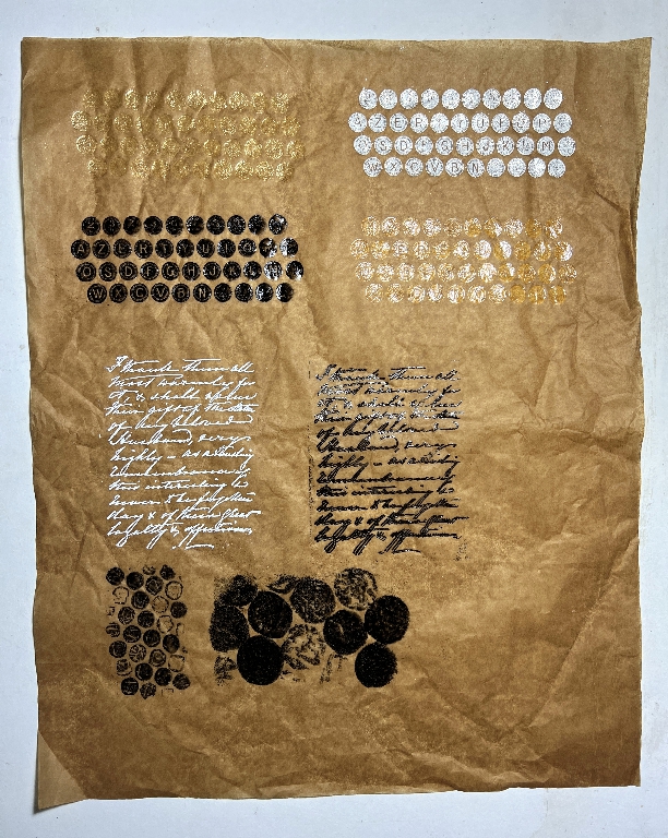
Top row: Typewriter keys from Tim Holtz’s stamp set “Deconstructed.” For the one on the left, I used Lindy’s Stamping Gang, King Midas Gold embossing powder, which is certainly a brighter gold than the Pirate Gold, at least on this paper. The one on the right was Shappy White embossing enamel by Stampendous (used mistakenly – I intended to use the Aged Ivory). This has quite a glittery effect.
Row 2: Black embossing powder, and clear embossing powder by Ranger.
The definition of these typewriter keys was clearer with the black than the other powders.
Row 3: Text stamp by Artistic Stamper, Calligraphic Mat #12, in white, and black. Unfortunately I moved the stamp for the black one, so that impression isn’t perfect.
Row 4: Stamping with my two small DIY bubble wrap stamps – small and large bubbles. I cut small fragments of these bubble wraps and wrapped them around a couple of wood blocks left over from when I unmounted all my wood block rubber stamps. I want to try using unsupported bubble wrap too, covering a wider area. You get really interesting textures from bubble wrap, for stamping and for use on the gel plate.
Experiment 5: Stamping
I used a selection of stamps from the Tim Holtz “Deconstructed” stamp set, and a text stamp from Darkroom Door “Correspondence” stamp set.
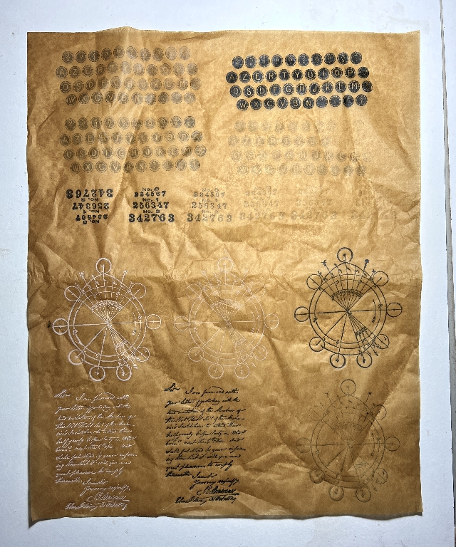
I stamped the first typewriter keys image using Ranger Archival Ink in black, but this didn’t come out as expected. The stamp pad may be a bit dry. I tried again, this time with Versafine Clair in black, which gave a good crisp result (top right). The other three typewriter images were ghost stamps from the Versafine Clair; the second one, under the Archival Ink one, looks almost identical to that stamp! The rest of the black images on the sheet were done with this ink.
The numbers in the second row were all stamped with Versafine Clair, the first two being primary stamping (replenishing the stamp from the ink pace each time) and three ghost stamps.
The white diagram from the Tim Holtz set was stamped with Hero Hues White plus one ghost (not worth bothering about), and another full stamp and ghost stamp using the Versafine Clair, with one ghost.
The two text images were stamped respectively with Hero Hughes White and Versafine Clair respectively.
The ghost stamps are very subtle, and depending on the context, I think they will be usable.
The white stamp pad in these samples is water-soluble so I’d have to be careful of the context of it in use, because adding wet media would immediately reactivate it.
I am hoping to find some good tutorials on the use of this paper, but in the meantime I’ve got enough material to pick and choose to embellish my Typewriter Album in due course.