TYPEWRITER ALBUM PART 8 – GATE FOLD FOLIO PAGE
A gate fold is a paper with the two sides folded into the centre, so that when you open them like opening a double door, the larger portion is revealed underneath.
I am grateful to Sara-Lee Armstrong for this design, which I saw on one of her videos this morning. It is an intriguing idea and I knew I wanted to include this interactive element into my album.
Creating the gate fold
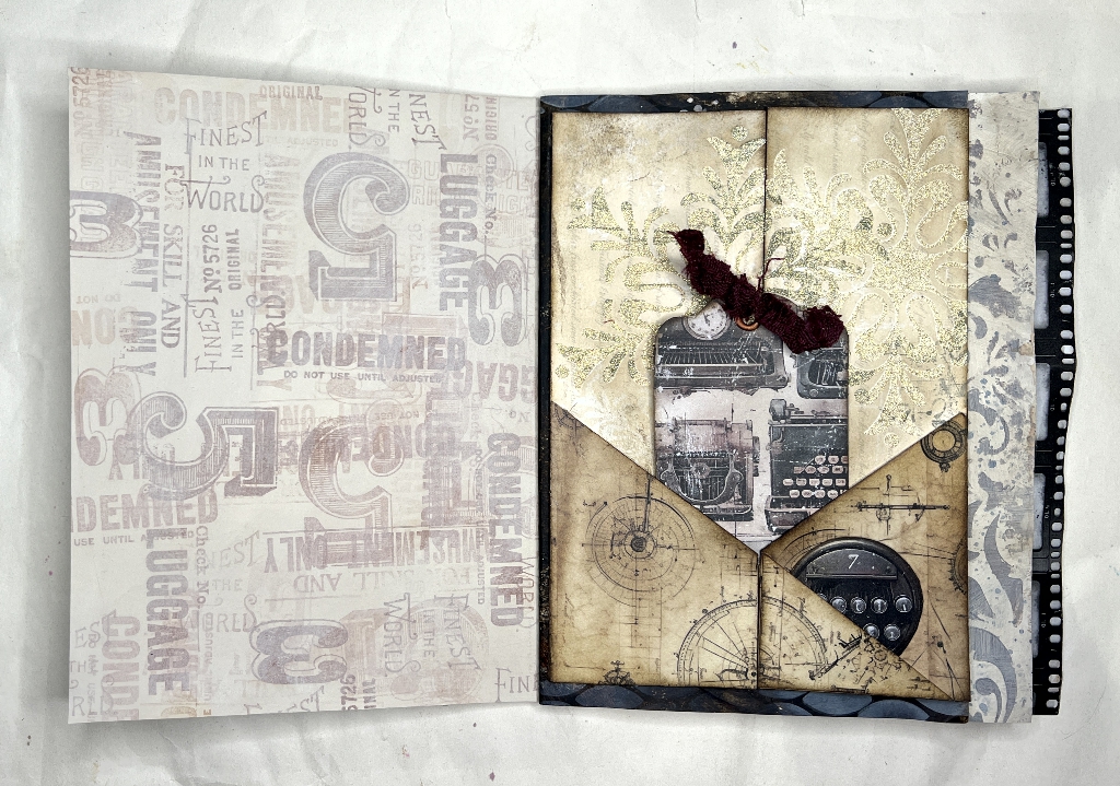
I had to watch this part of her video several times to see what she’d done because she flipped past the completed page rather quickly and I wasn’t sure which bits to glue, and how it would work.
The background paper is from a gold-embossed scrapbooking pad on the theme of winter (hence the snowflake design). I darkened it with some Vintage Photo Distress Ink.
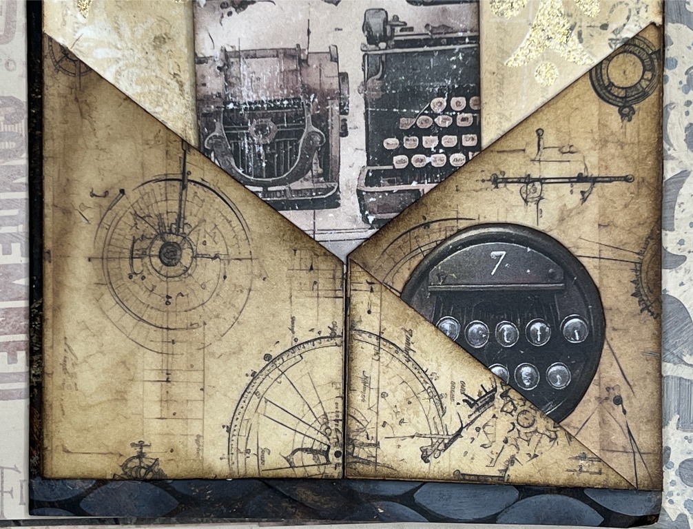
The gate fold is in two halves, cut down the centre, and the two halves are hinged right and left so that they open like a double door. The two triangular pockets at the bottom are glued all round on the background except for the diagonal edge. I took the cut off piece from the left-hand pocket and stuck it down again onto the right-hand pocket, glueing it on two of its edges to form another smaller pocket while retaining the continuity of the diagonal line of the left-hand pocket.
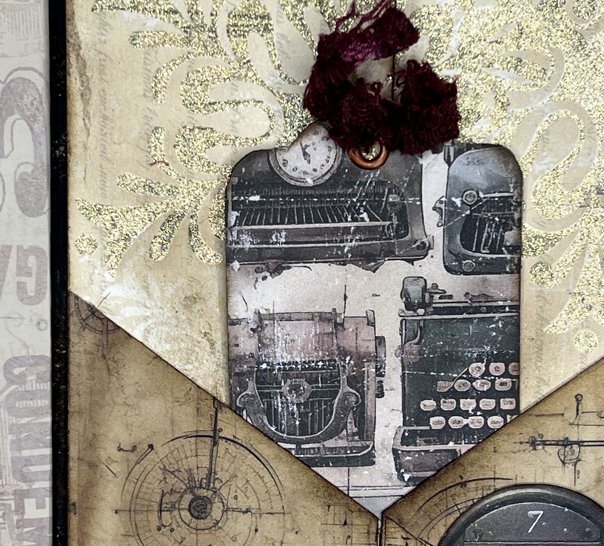
There is a tag inserted into the two triangular pockets, just down to the centre point where the flaps open. The tag is therefore supported only at its lower corners but that is sufficient to hold it in place. When in place, the tag serves to keep the folio closed.
The tags
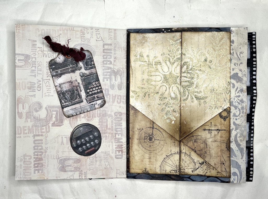
These are from the Typewriter Ephemera kit. I backed them both onto firm card and cut them out. The circular piece slots into the small pocket on the right-hand side of the folio. I added an eyelet to the top of the larger tag and inserted a strip of dark red fabric from the seam allowance of a garment I bought in a charity shop and took apart.
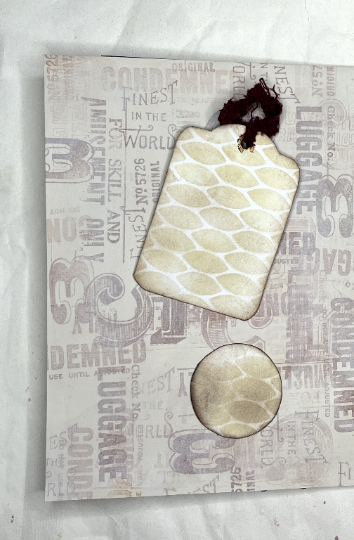
The backs of the tags. The reason I chose my “Seeds” stencil will be revealed when we open the folio. I used Antique Linen Distress Oxide through the stencil, and then darkened the whole thing a little with some Vintage Photo Distress Ink, mainly to dull down the stark white between the stencilled areas.
Some detail shots of the pockets and tags.
Inside the folio
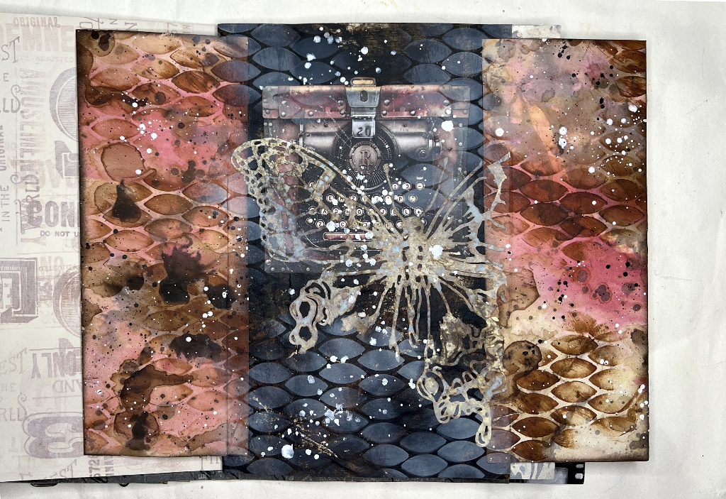
I lined the two side panels with pieces cut from one of my mixed media papers created from old bank letters. I chose this particular one because of the pink, which picks out the touch of pink on the vintage typewriter case. I cut them 1/4 inch wider in order to form the hinge onto the background, which was the original very dark brown page.
I took one of the large die cuts made from Tim Holtz’s Perspective Butterfly die – one of the “failed” cuts which produced the gorgeous tattered butterflies. I laid this down over the typewriter, fixing it down the matte medium painted over the page, and another coat over the top of the butterfly to seal everything down. I placed the butterfly with its top left wing tip as close to the fold as I could. The butterfly was too big for the central panel of the folio, so once the matte medium was dry, I trimmed off the part on the right that went over the fold, and made the cut edge more ragged by tearing small pieces off, so that it appeared to merge into the background of the flap on the right.
At this point, I felt that there was too hard a line between the folio flaps and the centre panel, so I decided to add some stencilling, using the same “Seeds” stencil I had used when creating the mixed media paper for the flaps. I laid it down, matching the existing stencilling on the flaps, and applied Antique Linen Distress Oxide with a blending brush. Being opaque, this Distress Oxide ink showed up against the dark brown background, and I managed to get a reasonably good transition between the two stencilled areas.
The final step was to add some white spattering to the central panel, to match that on the flaps. The white of the typewriter keys appears to merge with the spatters, with the tattered butterfly in between, causing it to look as if it is floating above the typewriter.
Some detail shots.
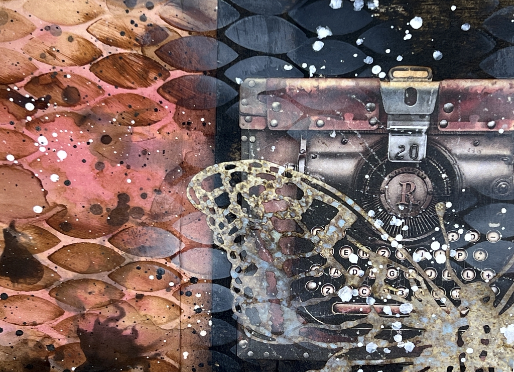
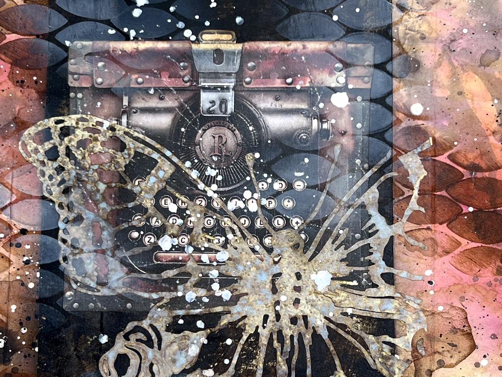
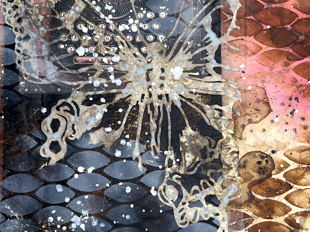
The addition of the butterfly, the stencilling and the spattering, creates a cohesive whole from a central panel and two flaps that previously looked like three separate elements, and giving it an ethereal look. I am very pleased with how this turned out. It was another example of a piece taking on a life of its own in the process of creating it, and why I can never plan to the last detail before I begin.