RECYCLED PAPER-GLASSINE BAGS ALBUM – WORKING ON THE SECOND FOLIO
Both the front and back pages of the second folio (made from a single bag) of this recycled paper bag album are now complete. I have begun work on the centrefold but so far only the background is done.
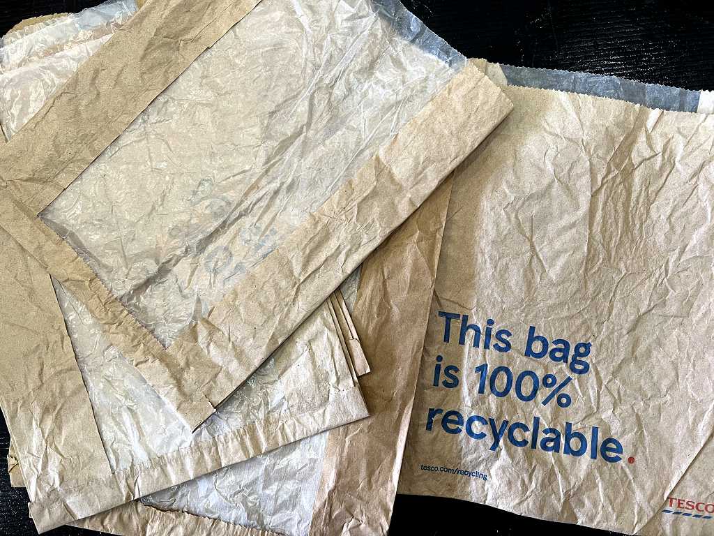
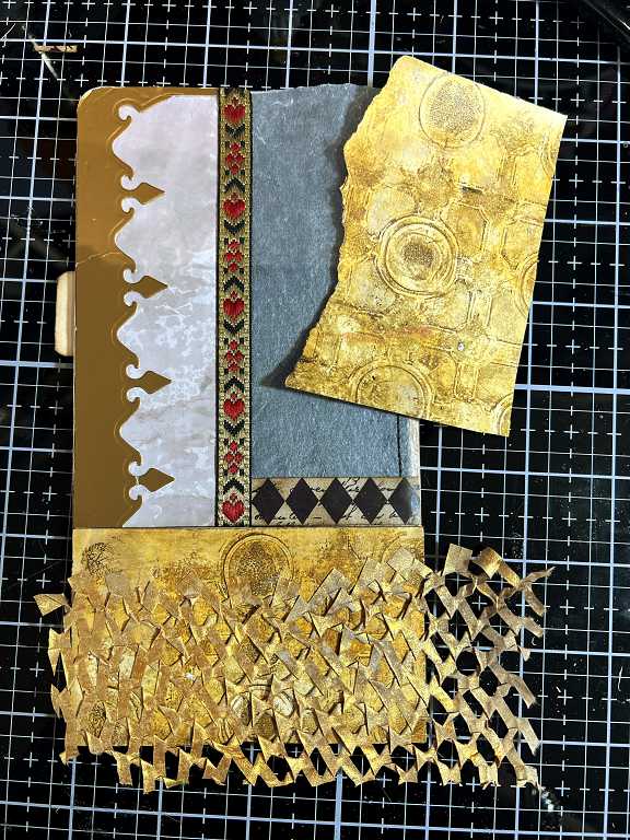
As a reminder, here are some of the bags I am using. Our supermarket has stopped using these now but I saved quite a few, thinking they might come in useful, despite their being very flimsy. There is a glassine panel down the front of the bag.
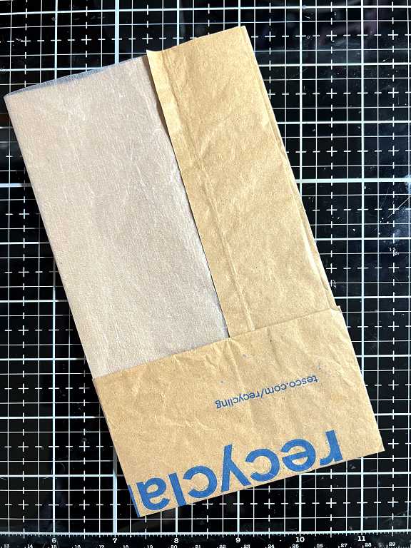
To make each folio, I fold up the bottom portion of the bag to form a pocket, and then fold the bag vertically so that half the page is taken up with a glassine panel.
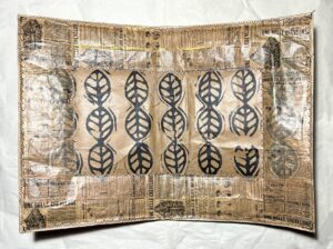
The second folio
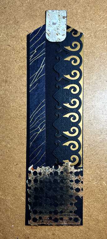
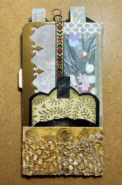
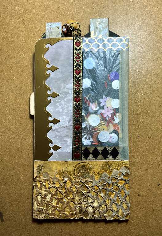
The first page

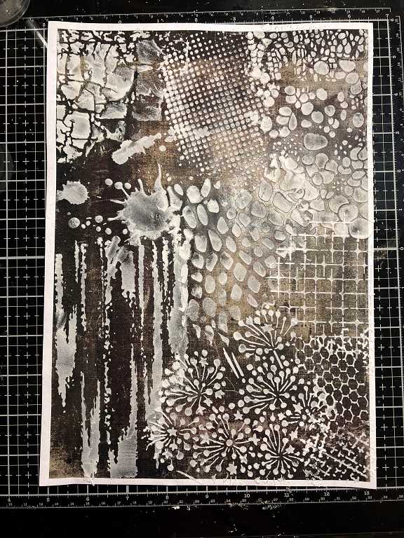
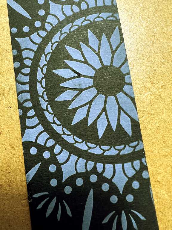
Quite a bit going on here! The background papers for the pocket at the bottom, and the panel on the right, were cut from some collage papers I made a while back when I was experimenting with printing and some foiling using my then new colour laser printer, and adding texture paste through various stencils. I cut the tag tops from one of these papers, too.
On this folio I have used several different washi tapes and some die cutting. We’ll deal with the materials and techniques with each element of the pages.
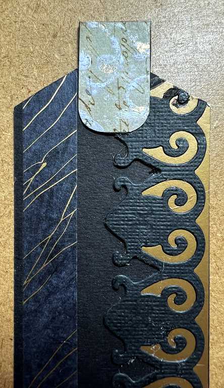
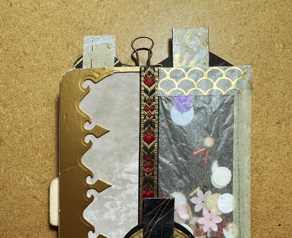
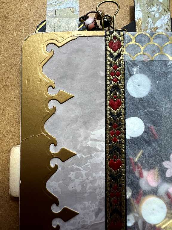
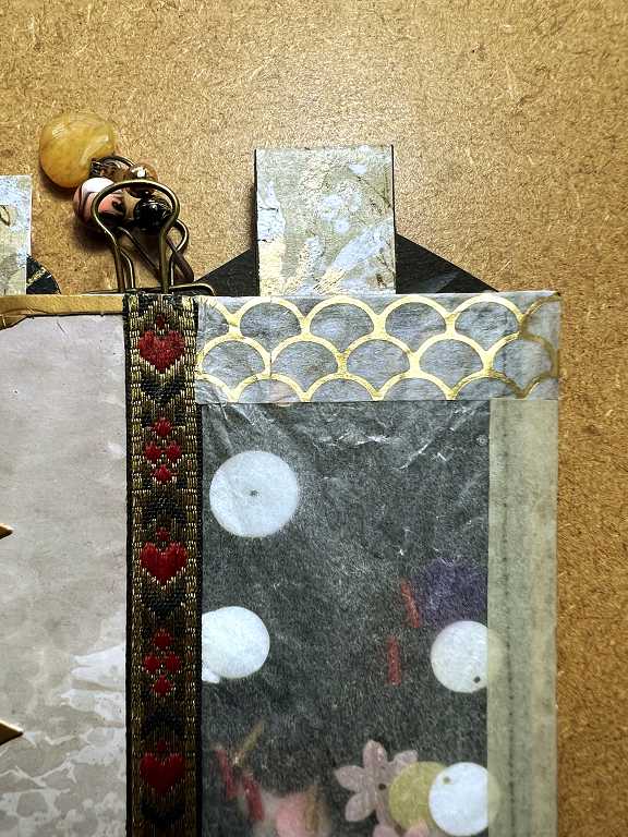
A close-up shot of the top of the first page.
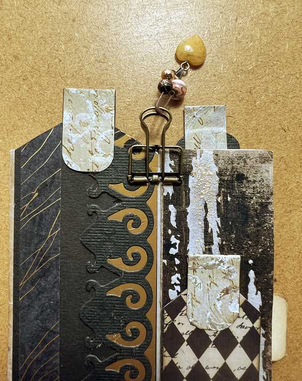
You can see that there is quite a bit of texture involved.
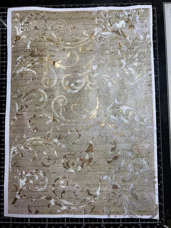
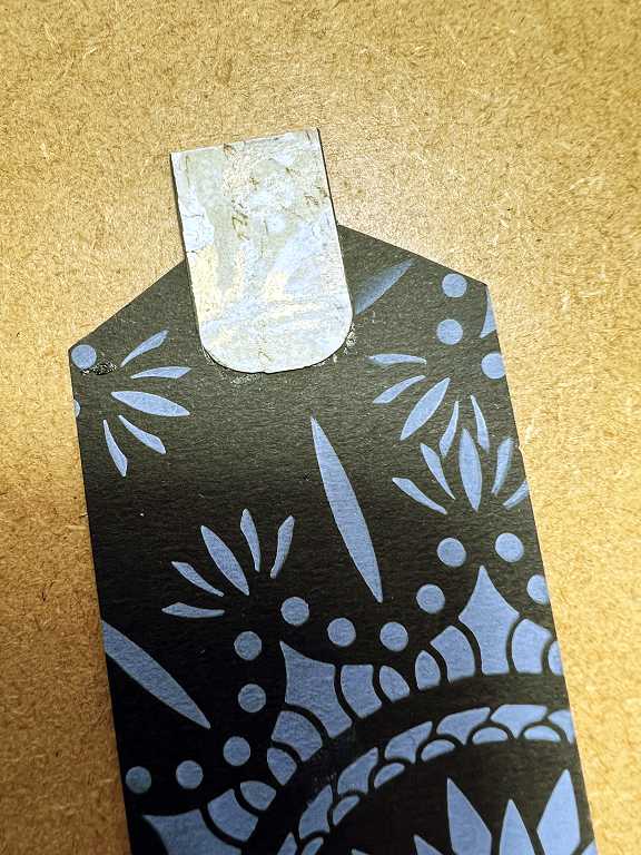
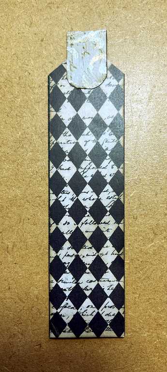
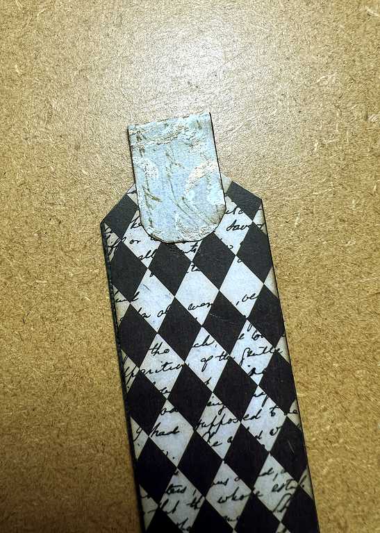
The tag on the right-hand side is covered with one of the papers I created when I was making my “Curious Cabinets” 3 x 3-inch tiny interactive album. The original inspiration was for the Graphics45 design “The Olde Curiosity Shoppe” which unfortunately is no longer available, but I created a number of backgrounds and elements on a similar theme, and was able to print them out at whatever size, and in whatever colour, I wanted. This harlequin pattern with the text on this tag is a smaller version of my original one.
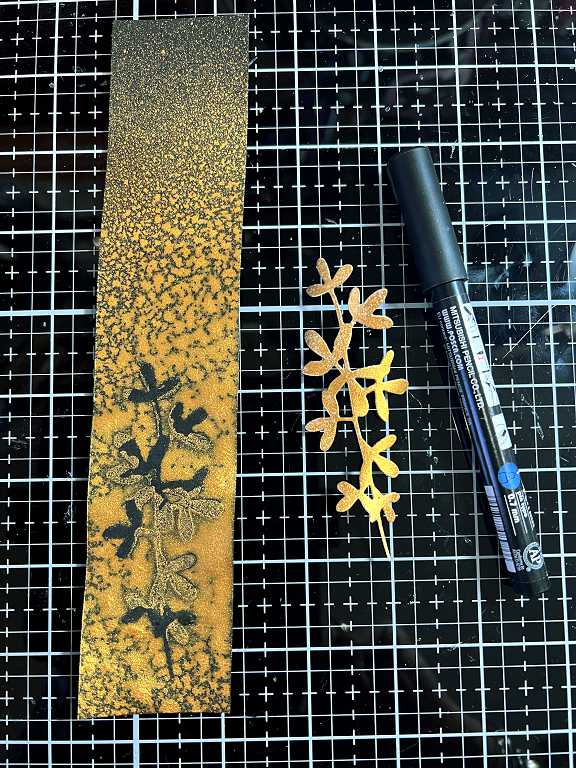
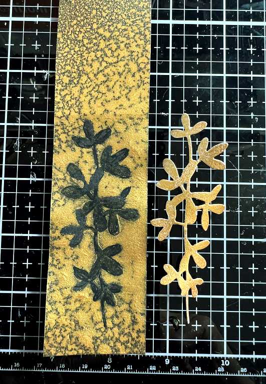
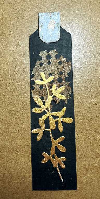
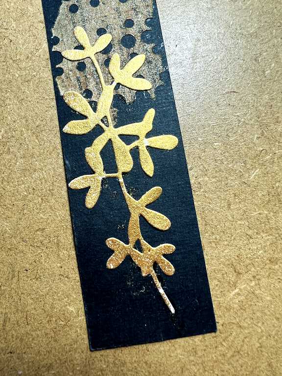
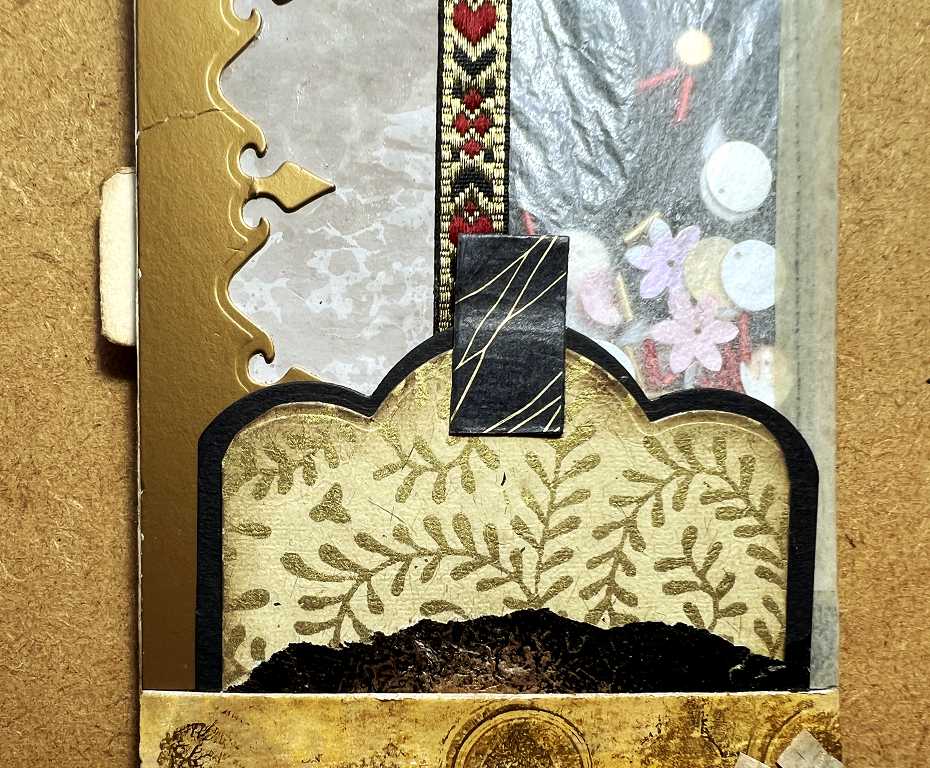
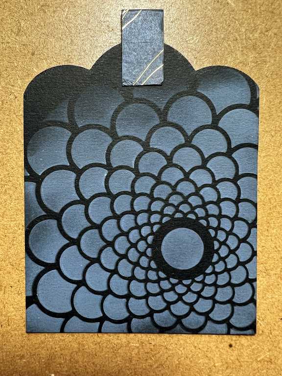
The larger tag on the left has a border made with a 2-die set. I have had this in my stash for ages and had never used it, and wasn’t sure what to expect! I did a test cut with the textured black card which appeared to be the background, and then cut the other one from some dull gold card which was part of some Easter egg packaging. The two pieces fit together. I have kept the negative spaces as they are interesting, and could come in useful.
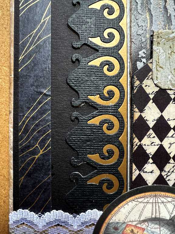
Black washi tape on the left, with little gold lines in it.
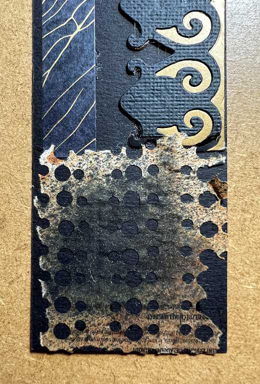
My textured and foiled collage paper covers the pocket across the bottom of the page. I believe the background print was one from the Graphics Fairy Premium Membership site. This pocket is embellished with some white lace, and a circular motif which came in a small gift pack with an order I placed with Taperlogy several months ago.
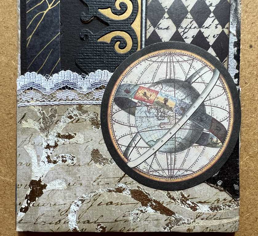
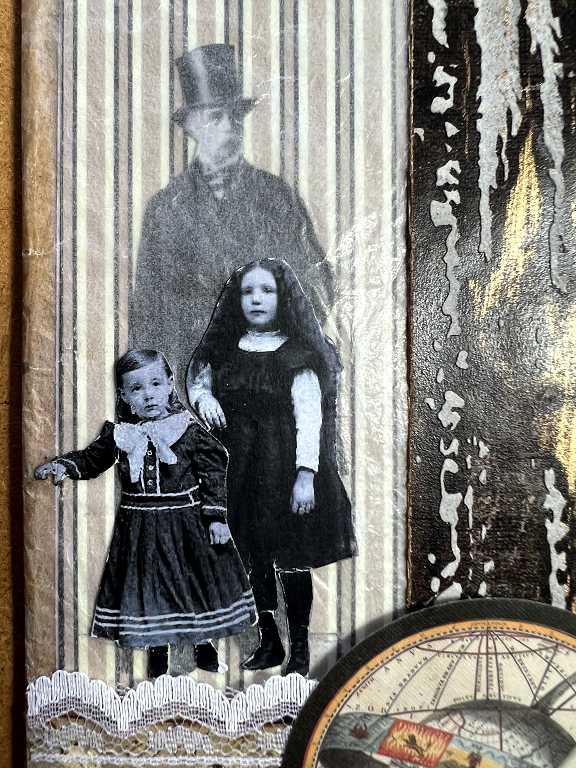
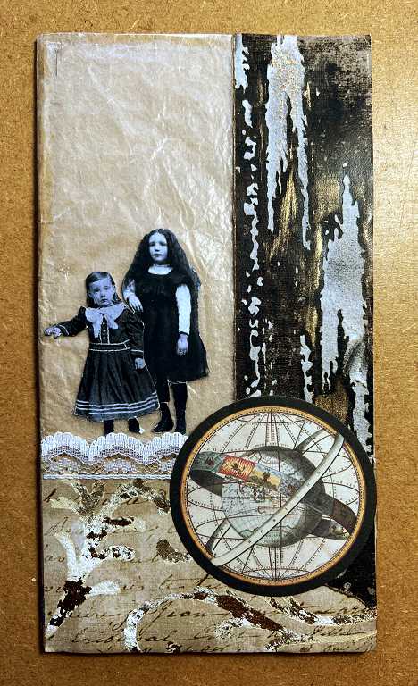
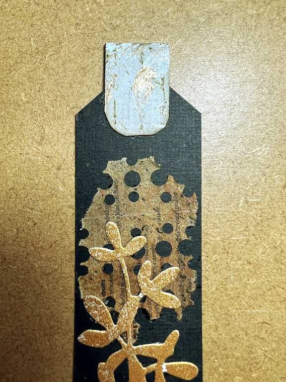
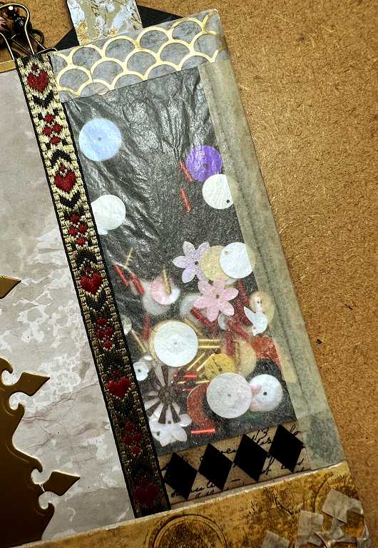
On the first folio, I left the top of the bag open to form the pocket, but in this case, for the first page, I glued the top closed, and carefully slit the right-hand side to form a pocket at the side. With the removal of the two narrow tags from the front of the page, the glassine panel is revealed, showing two figures from the Graphics Fairy Digital People bundle glued to the front, and a further figure on the tag inside the pocket. You can also see the full length of the gilded and textured piece of collage paper on the right-hand panel, and the tab for removing the large tag from the side pocket.
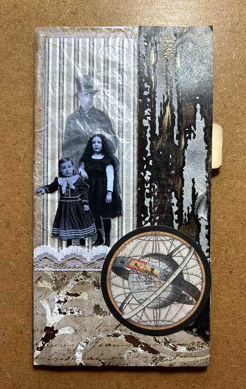
The figures in more detail. This photo also shows the gold on the textured panel quite well.
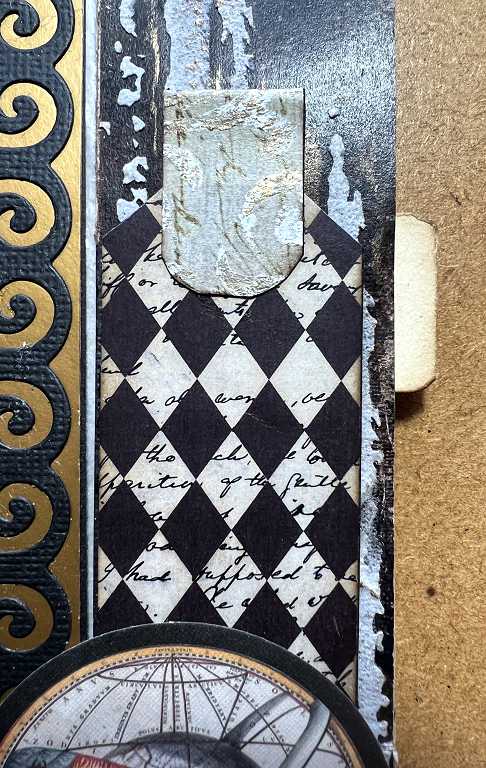
The page with the large tag removed from the side pocket. I did not line this pocket; it is the original brown paper of the bag.
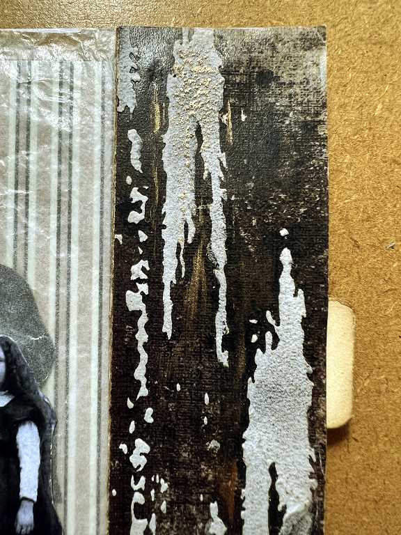
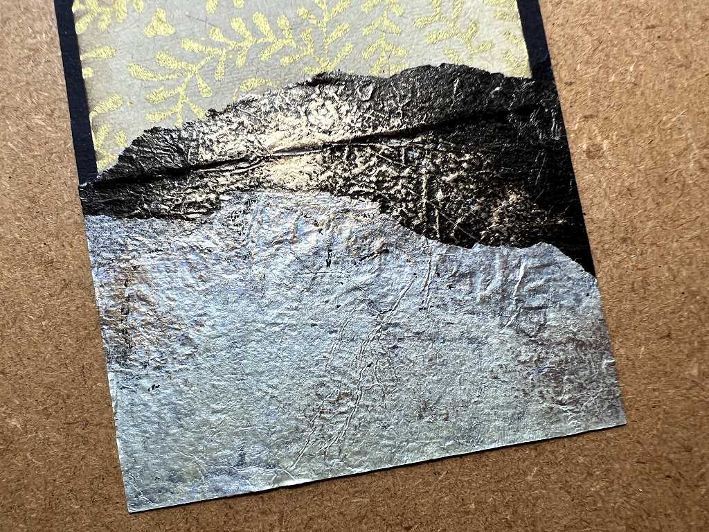
A detail shot of the gilded and textured panel on the right. The foiling doesn’t show up so well on this one.
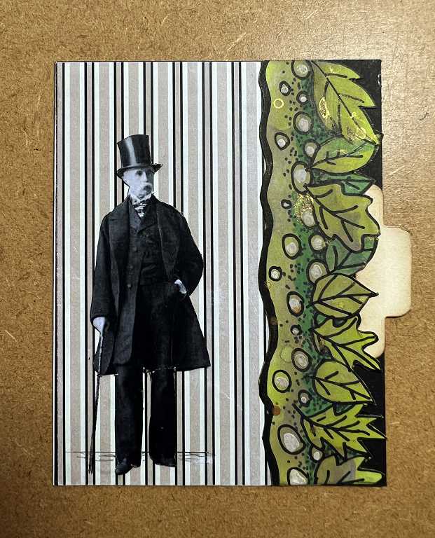
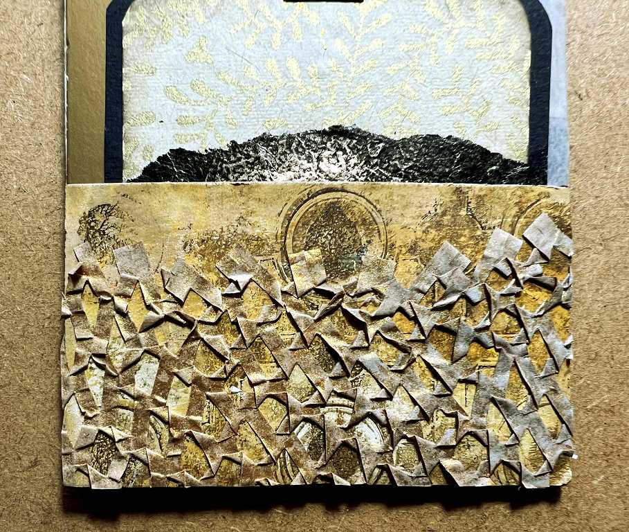
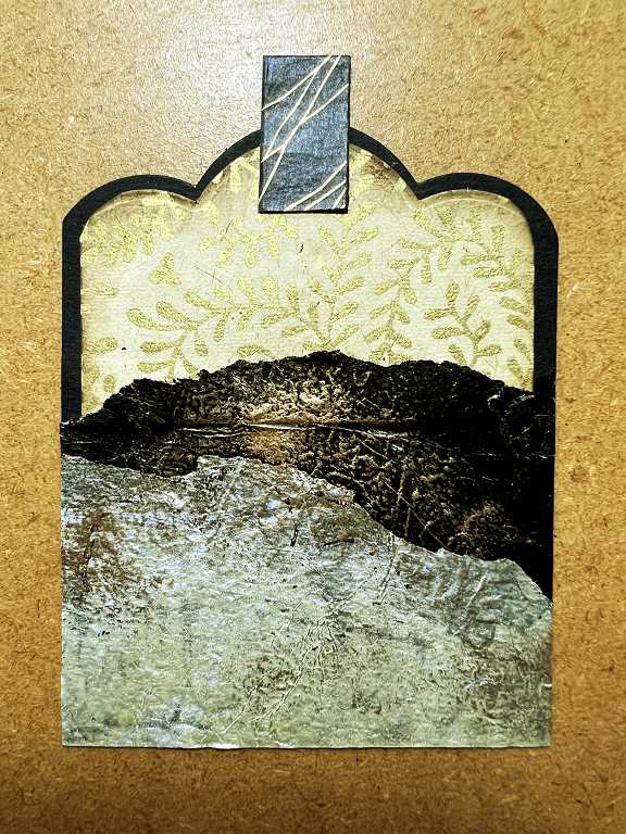
The large tag, removed from the side pocket. The background is another of my papers from my “Curious Cabinets” collection, and the border piece is one of my decorative strips. After I’d added this I wasn’t sure about it as it’s the only green thing on the page! It was rather bright, so I toned it down with some Pumice Stone Distress Ink.
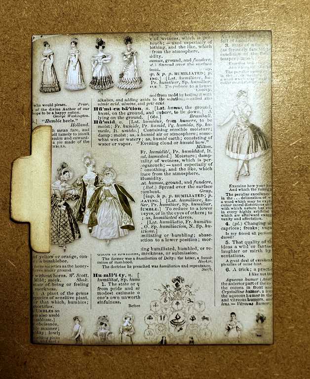
This is the reverse side of the tag. Again, this is one of my backgrounds from the “Curious Cabinets” collection, and I inked around the edges. The tab was cut with a die, and also inked to distress it.
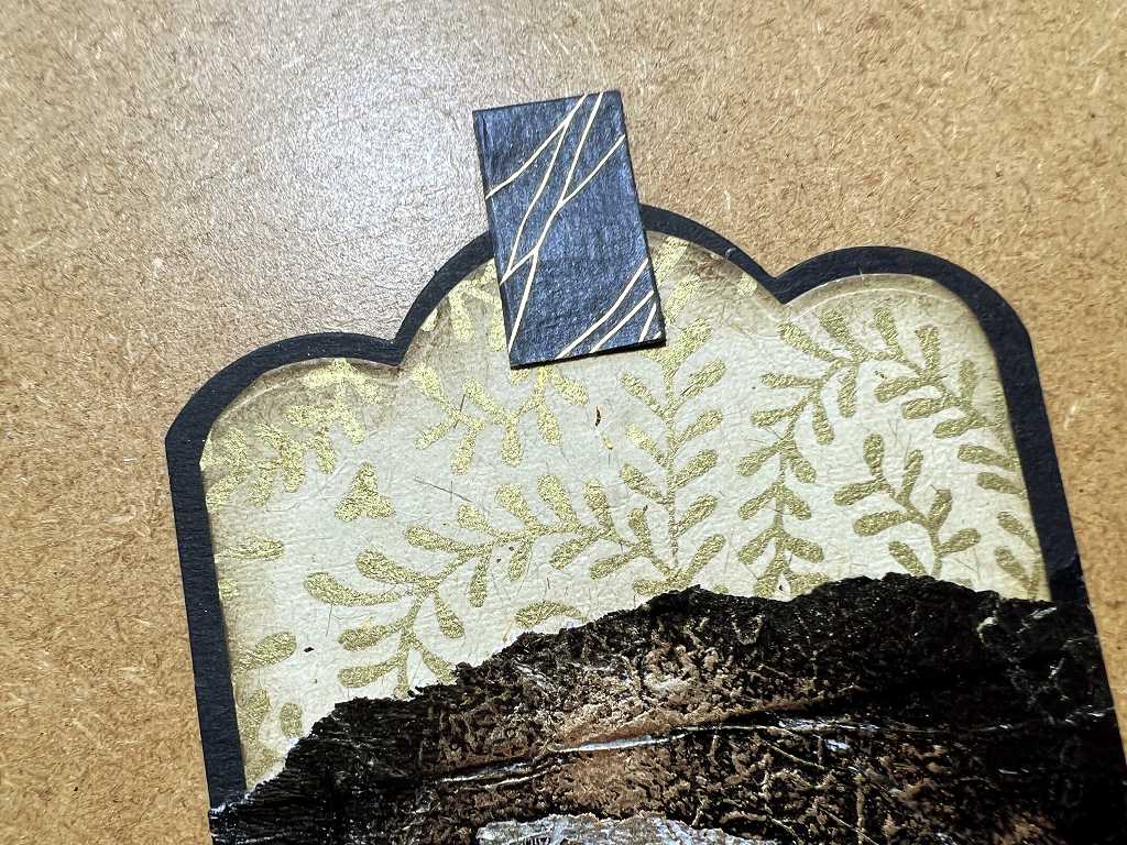
The tall narrow tag, removed from the page. The bottom part, hidden inside the pocket when in situ, is embellished with a fragment of one of my medication leaflet papers which had been used on the gel plate. The gold on it doesn’t show up on the photo, unfortunately.
I made these papers by punching holes through them before I opened out the original accordion form they come in. I used my Crop-a-Dile, punching holes of both sizes, in rows which I judged by eye, so there is a certain randomness about them. The papers are absolutely gorgeous; the printing on them adds texture; they can be torn along the perforations; they can be used as stencils (which of course colours them in the process) and they are great on the gel plate. I love the texture they produce. The great thing is that you don’t have to spend time laboriously folding paper into an accordion before you punch it, as the pharmaceutical company have kindly done it for you!! (Don’t worry – I read the original when I first started the medication and don’t need to do so with every repeat prescription!) The leaflets also come with my stoma supplies, and one of them has a leaflet folded into a larger square, so I can cut circles of holes in it – click the link above to see this, and other examples.
A detail of the top of this tag…
…and of the bottom.
On the reverse of the tag, I added some Pumice Stone Distress Oxide through a stencil with a blending brush. This has come out a bit more blue than grey-brown, but I’m pretty satisfied with it.
It was really hard to get the colour right in these photos – whatever I did with the colour balance, saturation etc., it came out looking a bit too blue. It’s more of a slate grey in reality. The Distress Oxides are brilliant for adding to black or dark cardstock because of their chalky opacity.
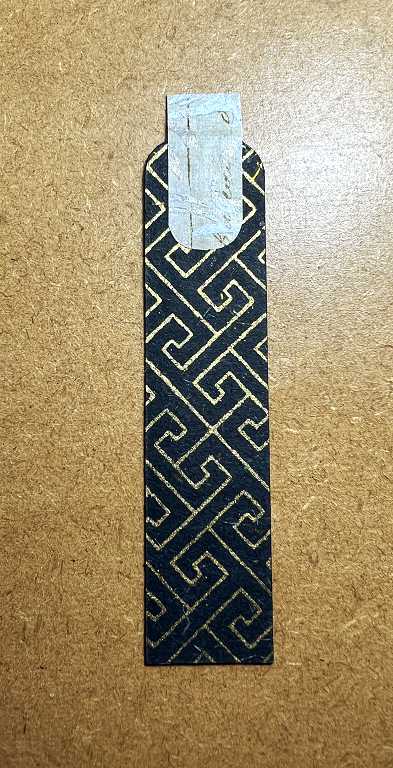
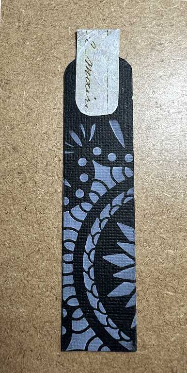
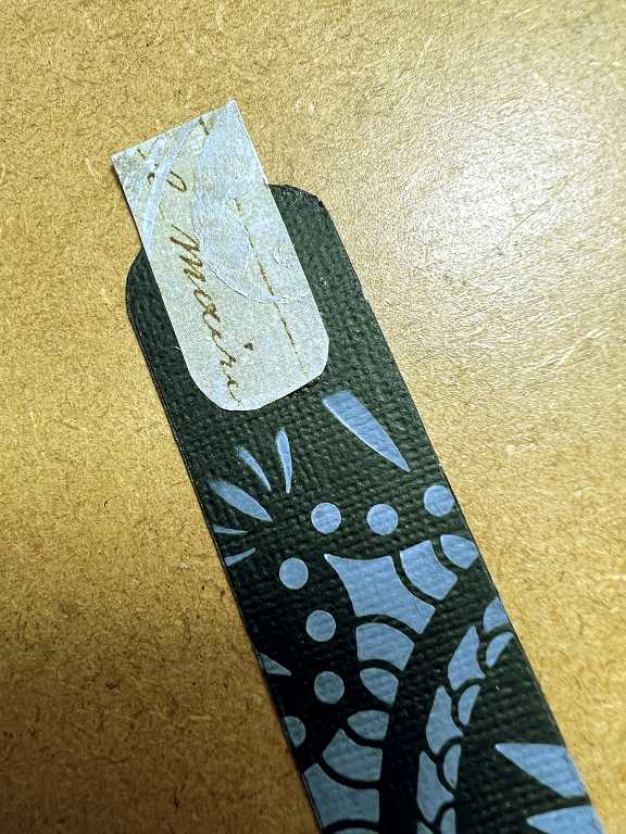
The small narrow tag with the “Curious Cabinets” harlequin paper, which exends the whole length of the tag.
Metallic spray woes
For the back of the tag, I thought I would spray a white leaf die cut with Seth Apter’s Gold Mine metallic spray. I managed to do a small amount, and then the nozzle clogged. I had endless problems with this, with the first bottle I bought, and the online shop were very reluctant to refund me and offered a discount on my next order, which I wasn’t happy with, and I shan’t be buying from them again! The replacement bottle has behaved perfectly until now, but it has gone the same way as the first one. I have been meticulous about removing the whole spray unit from the bottle after each use and flushing it out with water, but it’s hopeless. I have been using the original bottle for spattering the gold liquid with the tube in the bottle. Now that the second one has failed, I am drawing up a small amount with a pipette and putting it into a mini-mister for single use, which I then flush out. These do produce a finer mist than many of the empty spray bottles that you can purchase.
Back to the tag…
These days, whenever I am spraying a small item like a die cut, or making small die cuts, I place the elements carefully on a piece of cardstock so that I can use the negative space as well. I love how the spray fades out at the top of the scrap of black card I used when spraying the leaf die cut. I had hoped that the die cut would leave a nice clean image where it had acted as a mask, but quite a bit of the gold did seep under the edges.
I took a fine black Posca acrylic paint pen and carefully went over those pieces, and this is the result. Definitely useable!
Here is the gold sprayed leaf die cut in place on the back of the small narrow tag, together with another piece of punched medication paper.
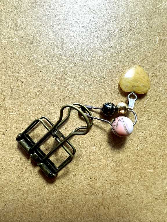
When the tags are in place on the front of the card, the larger one tends to flop about a bit because it is only supported by the pocket at the bottom. I chose a dull bronze wire paper clasp to hold it in place. I have seen people disassemble these, squeezing the base of the handles together and slipping them out so they could add embellishments, but these particular paper fasteners don’t seem to want to co-operate with this treatment, so I added some beads and a little heart charm from my stash to a bulb pin which I attached to the paper fastener instead.
Looking again at the detail shot of the top of the completed page, you can see this fastener in place.
The back page
Planning
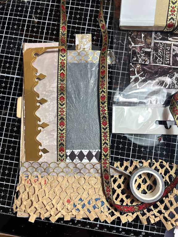
I got out a lot of bits and pieces to play around with, trying to decide on the layout for the back page.
I absolutely love this paper mesh that is often used for packaging fragile objects. It is so crunchy and full of texture! I have several small pieces which I have ironed flat – it is impossible to get it really flat, but it is slightly more manageable this way, and also acts better as a stencil to spray through. In this case I used more of the Seth Apter Gold Mine spray, this time in the mini-mister as the spray nozzle had failed after my first use on the back of the small narrow tag. The small scrap of black cardstock below the untreated paper mesh at the top of this picture is a test piece; a few blobs of spray but I’m pretty satisfied with how well the mini-mister works.
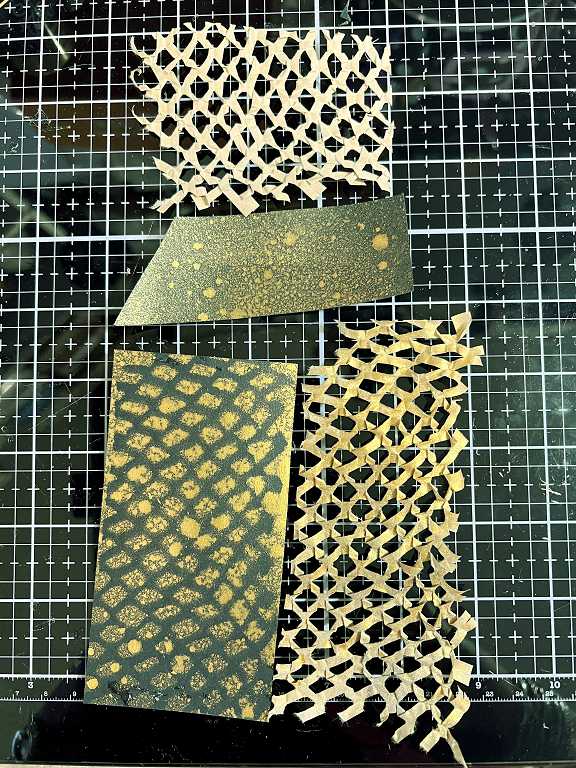
The gold, of course, doesn’t show up properly on the photo, but this spray is awesome – really intense bright metallic gold! The paper mesh looks great in gold, and I love how the piece of black cardstock I laid underneath has come out, too.
This is more or less the final decision made for the layout of the back page. I have laid a scrap of the bathmat paper from the gel plate on top to show what it is like, as the piece covering the pocket is somewhat obscured by the paper mesh. I just love the texture you get from ghost-printing with this! The suction pads on the bottom of the cheap plastic bathmat come out so clearly!
The dull gold piece on the left is the negative space left over from the die cut for the front of the large narrow tag on page 1. It fitted perfectly down the left-hand side of the page and even had a narrow bit across the top which acts as a reinforcement for the delicate edge of the paper bag. I think the light coloured background piece underneath was from another gel print but I can’t remember.
Before assembling this, I stitched around the glassine panel on three sides, leaving it open at the top, in order to form a shaker. It is lined with a scrap of black cardstock. There is a small strip of the harlequin “Curious Cabinets” paper across the bottom, and I have covered the stitching up the centre with a piece of red and gold Indian braid.
Here is the completed back page.
Step by step…
The top of the page. I have added some washi tape across the top of the shaker, partly to reinforce the edge, and partly to cover the line of glue which was showing through the glassine.
The die cut on the left, and the Indian braid.
The top of the shaker. The gold on the washi tape is showing up better here. You can also see the embellishments on the clip on page 1.
The tag in place in the pocket at the bottom of the page.
The pocket, covered with the bathmat paper and overlaid with the gold-sprayed paper mesh. I like how one of the circles has ended up in the middle! This wasn’t by design!
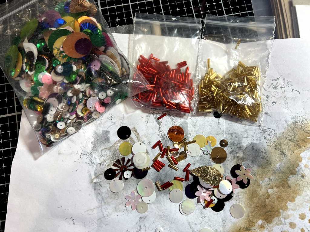
Choosing the twinkles for the shaker. I have had the large bag of mixed sequins since the Year Dot – I think it came with a job lot of stuff when I was doing a lot of embroidery. Most of the contents are not particularly useful, but I thought I would use some of the smaller pieces for my shaker. I tipped a whole lot out, and rejected the large pieces and any colours that I didn’t want in this project. I also chose a couple of different colours of bugle beads to throw in for good measure.
The back page with the tag removed, showing the full height of the shaker.
Detail of the shaker. Shake it about, and all the little pieces move around! I couldn’t make a book with translucent pages without including a shaker. I have added some plain washi tape down the right-hand side to cover the stitching and reinforce the edge of the page.
The tag. The tab on top is made from a piece of folded black cardstock with the black and gold washi tape added.
The cream and gold card at the top was a disappointment. I have had this layered pack of small pieces of decorative card for many years and decided that this piece would be ideal for my tag. When I examined the stack (only 5 or 6 pieces) they turned out not to be full-sized, but only small strips glued together at the sides, giving the effect of larger pieces as you went down the stack. What’s more, when I pulled them apart, the glue damaged the sides of each piece, leaving very little to play with. Fortunately there was just enough to add a mat layer to the top of this tag.
The papers collaged underneath are scraps of tissue from the gel plate, with iridescent and gold acrylic paint. Little torn scraps that ended up in my scrap bag. Once down, I added a little gilding wax for a bit more glitzy drama.
More stencilling on the back of the tag. Again, this has come out looking much too blue!
There was a narrow space behind the left-hand panel on the page, so I rounded the corners of a strip of scrap black cardstock to make another tag, for which I made a matching top tab from the same textured and gilded collage paper as before, and covered the front with some more black and gold washi tape.
More stencilling on the back.
It really isn’t that blue!
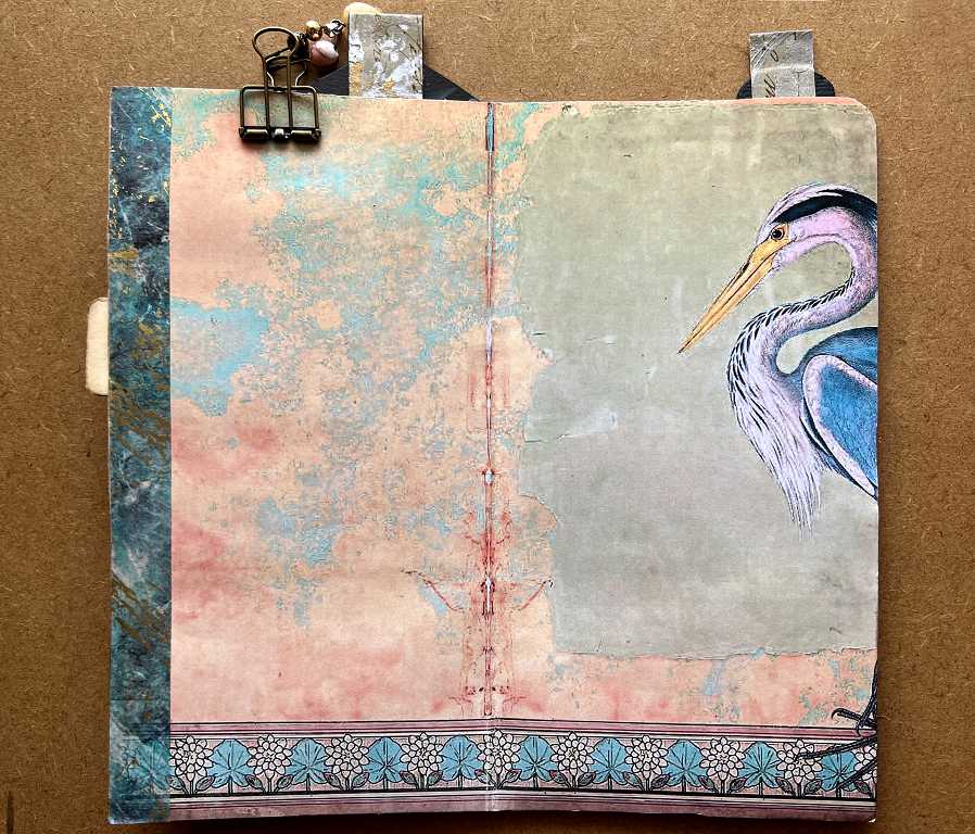
The centrefold
So far, all I have done is add a background. This was printed and trimmed to size from one of the Graphics Fairy Premium Membership bundles. The bottom border is part of the print, and I added washi tape down the side. I have not yet decided what I am going to add to this page.
Corner rounding woes
I needed to round the top corner of the back page because the Easter egg packaging was already rounded, and I may end up rounding all the corners of the pages when I complete the book.
I am FED UP with corner rounding punches! They never seem to work. A while back, I bought what I thought was a brilliant one, with three different diameters of roundings.
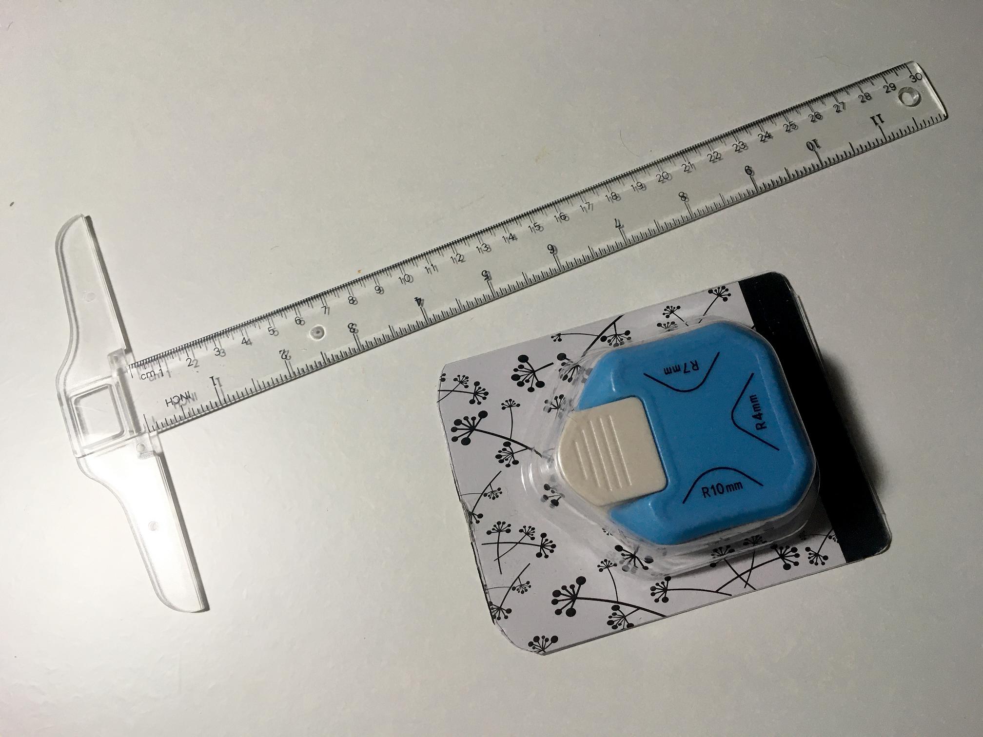
Sometimes it rounds the corners perfectly. Then, it doesn’t. It wrecks the corner. If there is any glue between the layers you are trying to round, and sometimes even when there isn’t, the little fragment of card gets stuck inside and you have to bash the thing against the table several times between each use to try and dislodge these. It’s a total pain, and being so unreliable, it’s not worth using it on something you can’t risk ruining.
I’ve decided to bite the bullet and spend a bit more money, and buy a heavy duty Crop-a-Dile Corner Chomper. This looks like a serious piece of kit! It has two sizes of corner and should meet most of my needs.
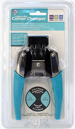
This had better work! Sometimes you come to the end of the road buying cheap cr*p and realise that you get what you pay for, and sometimes it’s worth spending a bit more money for quality! I do use so much recycled and trash material to make art out of, which must save me loads of money, so I think I can justify treating myself to some high quality equipment now and then! It’s on its way, so watch this space to see how I get on with it.